
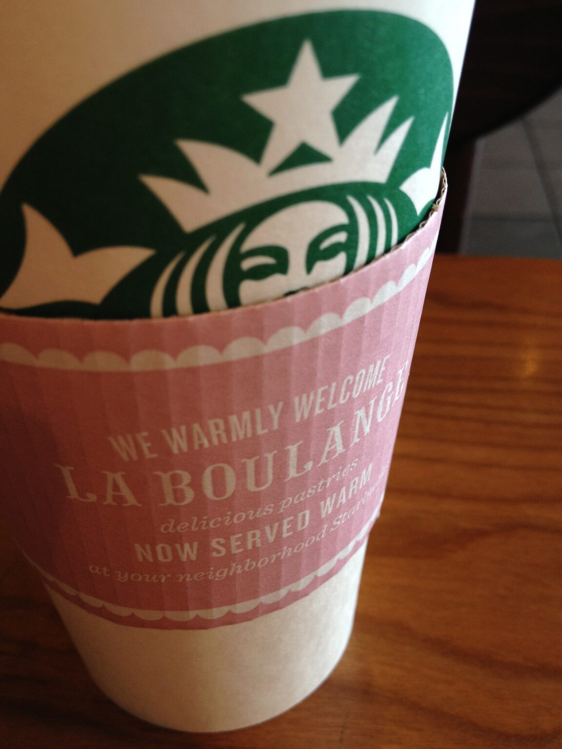
I’m sitting in Starbucks in Seattle trying to get a little grading done and drinking this fine cup of chai. I can’t stop looking at it, not because if the brilliance of their new baked goods products. Not because of the otherwise fine use of fancy type. But because they used white type on light pink and it’s damned near impenetrable,
And the stuff is everywhere — aprons, posters, menus, wallboards, the works. For a company that is all about strong earth tones, this is strangely out of character.
Did I mention wild use of condensed type variants on wallboard menus? From 10 feet, they’re just about impossible to read, even for someone with strong vision.